

A 2018 COLOR STORY: CELEBRATIONS
- Jan 1, 2018
- 13 min read
Updated: Dec 8, 2018
This upcoming year the colors are all across the board, making some quite UNEXPECTED color palettes that are sure to inspire creatives as well as various lifestyles. For this post, I'll be sharing my interpretation/imagining of Dunn-Edwards 2018 Color & Design Trends Report | CELEBRATIONS, which presents 5 different color palette trends and their application. Towards the end of the post, I'll have a breakdown to recap all the color families included in the trends report.
If you're interested in reading the original report created by Dunn-Edwards, please click here!

As I mentioned before 2018 color is unexpected. We acknowledge continued pursuits toward individuality, living a creative and authentic life, and following dreams. The colors are bold and encompass a wide range of design styles anywhere from chic, sophisticated, sensual jewel tones to sun-drenched, light-infused, childlike hues; insuring a color palette for virtually any personality.
There are a few main lifestyle trends that are pretty much taking over and actively having an effect on our color and design choices. The first, which actually isn't a trend anymore, is Athleisure and it embraces the casual life we've all come to know and love with a sporty, modern twist. Especially in fashion, where denim and leisurewear are dominating, however in the world of color and design it takes more of a minimalist approach with clean lines, multi-functional furniture pieces, and crisp, cool colors.
Next, is the growing Danish lifestyle trend known as Hygge (pronounced hue-guh) - loosely translated to mean...taking a holistic approach to deliberately creating intimacy. The point of this is to create connection and warmth with ourselves and those around us by finding happiness in the little things. Think of it as a compass steering you toward small moments that money can't buy, allowing you to find magic in the ordinary and truly live in the moment.
Finally, the idea of "Stealth Wealth" is also starting to grow. Stealth Wealth is all about embracing and bragging about living a healthy lifestyle instead of showing off designer labels and other material items. Ultimately, with these lifestyle trends, we begin shifting towards a social status about "who I am" rather than "what I have".

Through life, we collect experiences, gaining knowledge and desire for more stories to free the creative spirit. Whether it's a past celebration to honor and cherish, a celebration of creating unique spaces, a favored imaginative and playful celebration reveling in the unknown, a celebration of global adventure or a tale of celebrating the simple joys in life...each experience creates foundations for a future of hope and wonder. CELEBRATE!!

Celebrate the past! Memories takes us back in time, revisiting the traditions and classics of before, re-creating stories for today's lifestyles. Tailored to those looking for new experiences, exclusive spots, and unique flavors. With a romantic spirit, this design-oriented individual has a love of rich, highly-stylized design that is both luxurious and feminine -- uncompromising in taste. There's a heavy mix between hand-crafted fabrication and artisan design, allowing wood and metal to become more refined and natural materials are worked with elegance for added sophistication. Design influences include 1940's French fashion, Art Deco & Art Nouveau design styles, a modern twist on Baroque styling, as well as hints of 1920's Asian, British Colonial, and African inspirations.


COLORS:

These colors are really representing the idea of romanticizing the past with deep and muted dream-like tones. Below you'll find some color palette parings for a little added inspiration on how these colors can be mixed together.


Of course you can mix and match these colors in so many more ways, but hopefully these 8 schemes will jump start the inspiration for your next residential or commercial project. Maybe it will even inspire a new clothing collection, the palette for your personal/business website, or possibly influential colors for an artist's next masterpiece. No matter the project, the Memories palette was created to inspire a new creative outlook in regards to color and how we use it from day to day.


Getting excited, inspired, happy? Well, keep on reading for more and more COLOR!!! Next, we're going to start exploring the various colors associated with the natural wonders of the world.

Celebrate the world's natural wonders! A life experienced on one's own terms is a life of poetry in motion, arousing a renewal and dedication to unique experiences. To embrace each day surrounded by the world's natural wonders. A celebration of health and well-being inspired by nature and innovation; reminding us nature is random and increasingly important, resulting in many dimensional layers - new ways to eat, grow, and live with a focus on the essential simplicities. If you're looking to embrace a delicate style full of subtlety and modesty, this is the palette for you! It's causal and sporty with a back-to-basics focus on well-being without giving up the modern amenities of city life by people simply surrounding themselves with nature...without ever having to leave the city.


COLORS:

Earthy and natural, it's like these colors were picked directly from a beautiful mountainscape at sunset or extracted from the hot geysers of Yellowstone. If you enjoy all things nature, then this is definitely the palette for you. Below are some schemes that show a few ideas as to how you can pair the colors of the Natural Wonders palette.


There's a strong sense of contrast in this palette and it really shows within the schemes. For example, there are very strong, deep colors paired with more vibrant tones, which not only provides balance, but also a sense of sophistication.


Now let's take to the skies as we move into The Stars color palette, which is filled with neon-like influences and dark space tones representative of the cosmos.

Celebrate the stars! Fantasy experiences increase with the use of virtual and augmented realities. Life experienced through dreams and imaginations - unnatural nature - is the driving force of this palette. Many influences of retro, vintage, tech-like, old Nintendo games or bold neon signs are incorporated in unconventional or innovative ways. Fantasy brightens up daily lives with staged and spectacular tones attracted by bling and influences of the stylized pop-star. The palette is inspired by the hyper-innovator, who has a need to explore the great world's beyond; imagining we're not alone in the universe, drawing from hints of the paranormal and life's mysteries to expand the future. If you have a strong desire for excess, nothing too showy or colorful, but more generated towards having fun and enjoying life with that lingering element of mystery and the unknown, then this could be the palette for you.


COLORS:

I have to say this is the perfect palette for picking out colors for a kid's room or nursery or if you're interested in bringing out your inner-child then I would absolutely go with one of these schemes, but if you're feeling creative don't hesitate to create your own!
FYI: This is my favorite palette of the bunch for sure...


Scheme 1 & 6 are two of my favorites from this group...so fun yet not overly childish. I could even see myself putting together an outfit based off one of these schemes, creating something truly unique and special.


The upcoming palette is my #2 because all of the tones are so rich and jewel-like...I could see myself using some, if not all of these colors in many different ways.

Celebrate life's adventures! Fiction or fact - through myths, lore, and legends...oral storytelling recalls the historical narratives of cultures and peoples all over the world. The call to adventure and new worlds are for those who desire to be transported to faraway lands, creating a life filled with personal stories of adventures and lessons. This palette represents the Bohemian and Nomadic lifestyles, for those seeking the exceptional journey to imaginary lands filled with extraordinary sights and sounds. Focus shifts towards the pleasures of friends and family, creativity, and cherishing the little moments; in turn making craftsmanship more extravagant while tradition mixes with modernity. Luxurious materials appear exotic, almost mystical, favoring spectacular aesthetics and experiences.


COLORS:

So awesome! It's like each row could be it's own scheme, but honestly all of these colors go together extremely well...it's definitely one of those palettes where you could mix and match every single color with one another. They're muted, yet bold giving a subtle touch of adventure to any space, project, or creative idea. Let's pair em' up!!


Loving all the schemes in this one and I could totally make 8 more, but I won't torture you all with that hahaha. Instead, I'll leave it to you to come up with your own schemes, plus it's just so much more fun that way. ;)


The last color palette on my trends list might end up being the fan favorite as these tones and hues are super hot and on trend right now. Ease on down onto a fluffy pink cloud while you let your mind embrace whimsical thoughts and fantastical vibes, because for this next palette we're exploring all our favorite Childhood Joys.

Celebrate the simple joys in life! These colors tell a traditional story of comfort and routine that reflects how a child is free to dream of other worlds with rainbows and laughter; fun and games; and new adventures through children's literature. Inspired by the simplicity of Scandinavian design, yet more sophisticated and streamlined. A scheme that allows for a fun, cute, and smart daily lifestyle where design serves the user without loosing its soft or amusing side, contributing to an easier, ultimately better, everyday life. With tons of new ways to get together, work, move around, and even joint living situations between colleagues, friends, and family, combine in order to provide that underlying sense of community and togetherness.
"Try to be a rainbow in someone else's cloud." - Maya Angelou


COLORS:

These soft, dusty tones were just beginning to gain popularity over 2017 as a sophisticated alternative to traditional pastels. However, moving into 2018 you can probably expect to see these types of tones all over the place. From fashion to graphic design...these colors will guide us through the year. In this palette, there are also some darker hues, which help provide depth and dimension to these otherwise subtle colors as well as punches of brighter hues to help add that child-like fun.


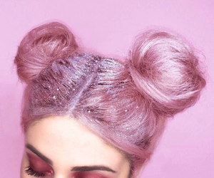
For this one, Scheme #1 is my favorite...I could see it being used in a feminine desert oasis or even for a trendy outfit color palette. The pink and teal color pairing has become a trend of it's own, as I'm sure you've seen spaces designed with graphic palm tree wallpaper and pops of pink. I even use it (more than I should) from day to day with my different outfits. I think we're going to be seeing this color combo a lot more as we get further and further into 2018.


The next section of this post is going to dive a little deeper into the color families presented in the palettes above. Each family is equipped with it's own characteristics and reasoning behind why they're so on trend. This helps when you're trying to be more specific and clever with your color choices, allowing you to pinpoint your desired shade of red/pink, blue, or even cool versus warm neutrals. I'll also include some awesome photos illustrating the different color families and how they're used in everyday life.
COLOR BREAKDOWN

Sticking with 2018's color theme...UNEXPECTED...the colors you're about to encounter in this next section are just that, unexpected!!! We'll explore the wonderful worlds of reds/pinks, oranges, yellows, greens, blues, purples/violets, warm neutrals, and cool neutrals; showcasing the countless ways these colors are and can be used. Hopefully you'll leave feeling inspired and ready to inject more color into your everyday life.

Reds show in a range of yellow and orange undertones, as well as browned reds and brick tones for substance and depth. Pinks are everywhere!! From blush, to berry, to browned beet the pink hues range all across the board. Intense pinks play up rebellious attitudes, while bubble gum, sorbet, and grayed pinks play up romantic influences. These colors are used in tonality from powder pink to hot pink and everything in between. Pinks add a surreal, street graphic effect, modernizing the use of the hue, while red sticks to more of the traditional style hoping to not overshadow the growth of the pink trend.

As you can see there are more pink hues than red, reinforcing the idea that pink is now in the forefront and being used in other ways besides trying to evoke a feeling of romance or femininity. They range from sporty and vibrant to soft and muted, whatever the use, pink...might very well be the new red. Check out some of these photos that illustrate the amazingness of Reds & Pinks.


Oranges pop through chili and rust tones. Overall, there's less influence of orange in 2018, with most of the definition going to warm browns and neutrals. These tones are earthy yet bold, which sets them up for use as base colors as well as accents. Orange usually isn't popular among many people and as we move into 2018 we'll continue to see orange more as a prominent undertone for other colors. No matter the shade, orange will be sure to turn the heads of guests, spark up conversations, and add warmth to just about anything.

Here you'll see just how neutralized orange is really becoming...mimicking more natural materials like copper, rust, leather, wood, and other organic elements. Oranges pair well with greens, blues, purples, and even pinks so the more neutral the orange the more freedom and flexibility you'll get when thinking of pairings and color combinations.


Golds are highlighted with red undertones, while green-tinged yellows illustrate the eco-spirit lifestyles with spring plantings. Brilliant, flashy yellows cater to more sporty, summery, and festive palettes. While softer, grayed yellows energize what many categorize as pastels. Yellows are used in many different tones and hues, often for shock value or to evoke feelings of joy and happiness. With the shades that lean more towards green, the color presents freshness and crispness, providing a sense of health and well-being.

Nothing too bright or over-powering, but the yellows in this group are anything but boring and subdued. The golds have a metallic influence, while the others feel more earthy, drawing lots of inspiration from different foods. There are several creative ways to incorporate yellow into daily life, keep scrolling below to see just some of them.


A key color trend of the year. Greens appear in jade, olive, foliage and sage tones through summer then shift towards teal, chlorophyll and blush-greens throughout the winter. Deep, rich greens add an air of refinement and upscale craftsmanship, which are especially popular among Art Deco, Art Nouveau, Modern Farmhouse, and Contemporary design styles. Greens can also be found as the 2018 Color of the Year for many different companies. For example, Dunn Edwards named The Green Hour (DET 544 - see below) their color of the year and Sherwin Williams went in a similar direction with Oceanside (SW 6496), a bluish-green jewel-toned hue.

Green is a favorite color of mine and these shades are definitely drool-worthy. There's a slight nod towards teal and turquoise rather than the typical yellow-green or leaf green we've all gotten so used to, but now we're leveling up with a new found sophistication. This color family is considered serene and calming, perfect for de-stressing in any situation. Use in a bedroom, the bathrooms, a fun family room, or even your own personal dressing room (for those lucky ones) to bring tranquility or incorporate these tones into your wardrobe for the ultimate laid back vibe.


The blue color family also continues to play a key role in many industries and is still a fan-favorite for designers, fashionistas, cosmetologists, and even food artists. The hues are deep and dense, showing in opulent, bright, and aquatic ranges, along with near-black night sky shades. Sporty blues are bright and cheery; utilized heavily throughout commercial and public spaces. Blue would also be a great accent color, paired with cool or warm neutrals, and any shade from this color family is sure to impress!

From bright to dark, blues have got you covered. I especially like Cobalt (DEA 140) and Pacific Blues (DET 586), mainly for their intensity, but also the vibrancy just puts a smile on my face. It would even be cool to paint some accent furniture in one of those colors for an unexpected twist to any indoor or outdoor space. In fashion, blue is one of the most popular colors to use, besides black, because it's easy to match with a range of skin tones and hair colors.


This trend season purples turn up in lavender shades as well as magenta-based violets. Violets are inspired by a fusion of nature and technology, creating supernatural mysterious effects. Purples have a whimsical, dreamy influence resulting in dusty tones rather than pastels. If you're looking for an unexpected accent that's sure to strike up a conversation, purples/violets are the way to go!

Magenta, plum, fuchsia and lavenders are the star players of this color family. Since jewel-tones are so popular this 2018 trend season, the purples/violets hold a special place in the ranks. Most of these colors are used for boldness and depth, adding that little bit of mystery and elegance to a space. The photos will really give you a sense as to how these colors will behave in real-life applications.


Within the warm neutrals is the classic brown family, which are lush, rich, and grounded adding layers of depth through varied undertones - from clove and coffee, to caramel, to chestnut and camel. References to retro design are a large influence with emphasis on the 90s texture play in combination with pairings of browns and warm grays.

Comforting and welcoming are the two words that come to mind when describing this palette. Pair with ultimately every color possible for an added touch of nature because these tones are so earthy and organic. Translate the color into wood tones or metallic accents instead of using them as paint or create an all warm neutral outfit by mixing blush tones with other beige, browns, and tans for a truly sophisticated look.


Grays nearly disappeared towards the end of 2017, but remain strong in the 2018 trend mix through a variety of classic and soft tones. Many of the cool neutrals are highlighted in architecture, landscape, weather patterns, as well as metal materials and natural textures. The darker shades are influenced by deep charcoals and even dusty slate blues.

50 shades of gray is no joke in this category...many of the grays used throughout these palettes are a reference to nature or some type of natural material. Similar to the warm neutrals, these colors also have a wide range of undertones allowing them to be combined with many different colors. Grays are also now starting to be paired more and more with browns, tans, and beige for a more contemporary look. Take for example using a medium tone wood floor with a light gray on the walls and then pairing it with other wood or metallic tones to add depth and character to the space. In fashion, use a gray as your base color and play it up with brighter accessories...some popular gray color pairings include yellow, orange, red, pink, and teal, but there are limitless possibilities when it comes to using gray in your scheme.


Well folks, that concludes my little summary of Dunn Edward's 2018 Color & Design Trends Report and I sure do hope you enjoyed reading...or looking at pictures. Hahaha I'm a visual person, so no worries, I can definitely understand. Either way I hope you all are leaving with a smile on your face and inspiration in your soul. Hope everyone has a happy happy New Year!!! Stay safe :)


Comments